|
|
 |
|
|
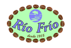
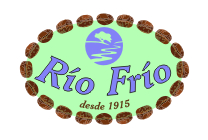
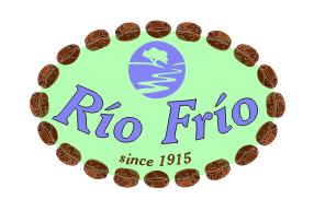
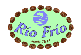
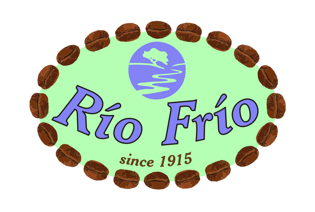
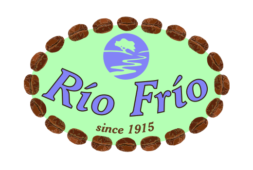
Corporate Identity ManualThe Rio Frio logo ...
... has several key elements:
Notes on the integrity of the Rio Frio logoThe logo must always be based on a pure white background. If the logo needs to be placed on a background field of another color, then the white rectange must be maintained for at least a distance of 10% of the height and width of the light green oval field. The FontThe core font for the Rio Frio logo is Cheltenham BT, a TrueType font designed by Bitstream. These variant used in this logo is Bold-Italic. The specific font name is "Cheltenhm Bold Italic BT" and the font file is "Chlthmbi.ttf". ColorsThe Rio Frio logo uses nine colors, four shades of brown in the beans and five other colors:
The coloration of the 20 coffee beans on the border of the oval are designed to depict high-quality Arabica beans grown at high altitude, regardless of the sizing of the logo. Correct coloration is critical to maintaining this positive image:
Four colors are used on the beans:
Business Card DesignHere is an example of the logo in use on a 2" x 3.5" business card
The font is Swis721 Hv BT, generally considered to be substantially more readable that similar sans-serif fonts such as Arial. Note that the title of of the person on the lower right is the italic variant of this font. Letterhead DesignHere is an example of use of the logo on standard letterhead:
Note that the horizontal line bleeds to the right of the page. Downloadable FilesThis section provides links to files that can be use for graphic design purposes with the Rio Frio logo:
|
|
||||
Beneficio Rio Frio
|
|
Welcome | Company | Production | Honors | Coffee Facts | Resources | Contact Us | Español Site Map Copyright © 2008 Beneficio Rio Frio. All Rights Reserved. v1.03 - 15Mar08 |